
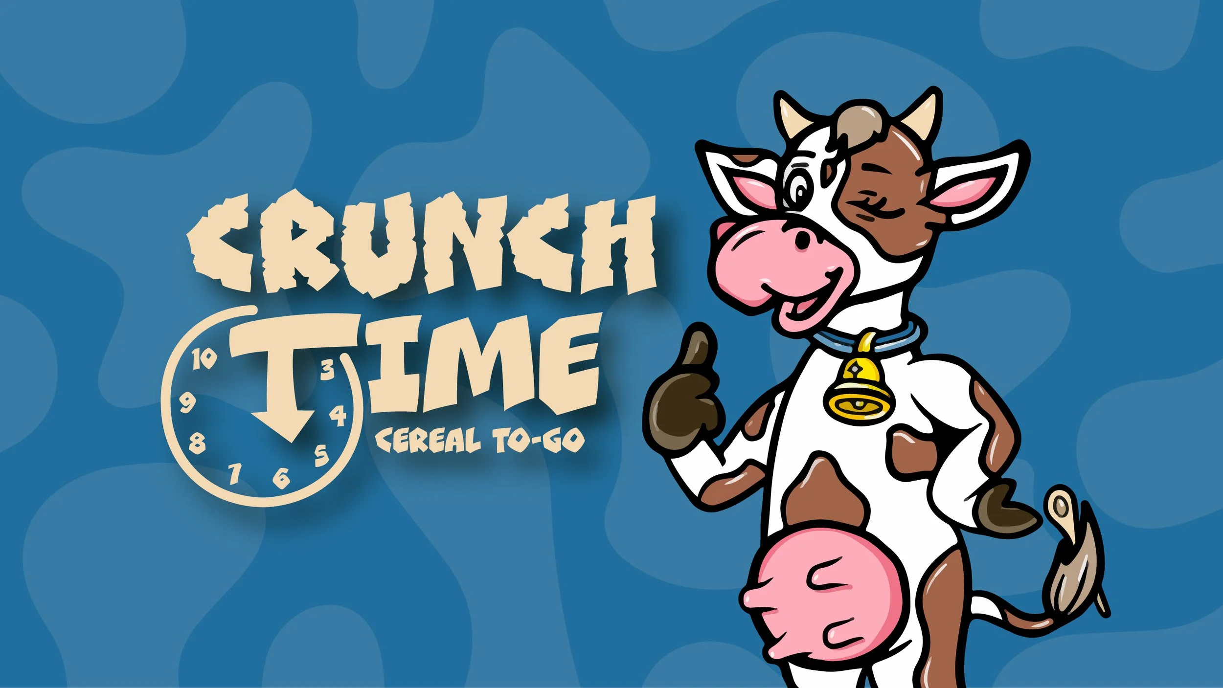
Crunch Time: Cereal To-Go is a food truck inspired by the nostalgic look of classic cereal boxes. The brand identity features bold typography, playful packaging, and Connie the Cow as its mascot, with cow print as a signature pattern. Deliverables include logo design, food truck graphics, packaging, menus, and employee wearables, creating a cohesive identity that feels fun, bold, and nostalgic.
Art Direction / Brand Identity / Logo Design / Package Design / Illustration / Print
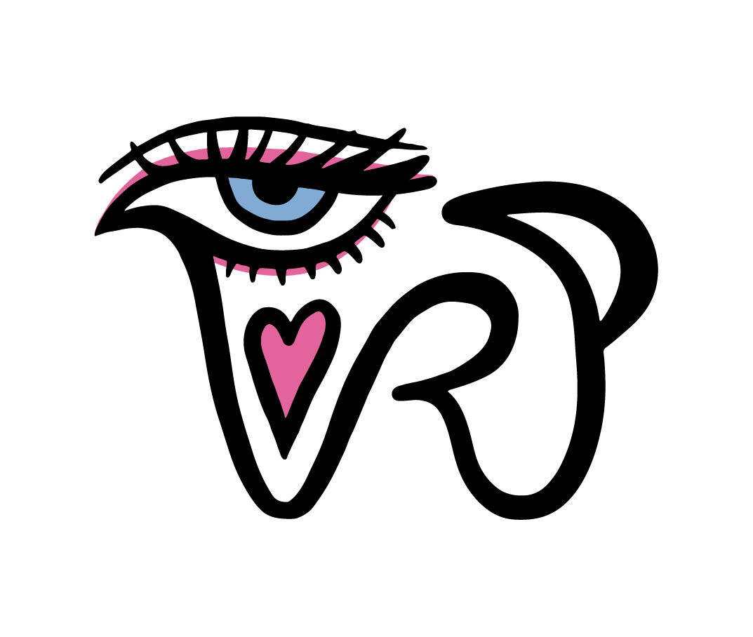
Crunch Time
Brief & Target Audience
Breakfast on the go? No problem! Crunch Time: Cereal To-Go was created with students and busy professionals in mind, bringing fast, fun, and customizable cereal experiences directly to campuses and corporate areas. Breakfast is often the most skipped meal of the day, and Crunch Time makes it easy for people to grab a quick, satisfying meal on their way to class or work.
What the company needed next was a cohesive brand identity that reflected the nostalgic, playful vibe of classic cereal boxes. The challenge was to design a brand that could translate across multiple assets, such as the food truck, packaging, menus, and employee wearables, while keeping a consistent, memorable identity centered around the mascot, Connie the Cow.
Process
I started with sketches and early ideas (seen below) for the cereal brand, focusing on typography that felt like you could “take a bite out of it,” inspired by classic cereal logos. The clock element plays on the concept of “time,” and I was excited to incorporate the letter “T” into one of the arrows on the clock face.
For the color palette, I chose blue as the primary color: a bold, classic cereal-box hue that evokes friendliness, calm, and reliability for busy mornings. Pink serves as the secondary color, accentuating the blue and adding a sense of fun and playfulness.
Creating a mascot was key, as every classic cereal brand has one. I personally illustrated Connie the Cow to tie in the cereal-and-milk concept, and the cow print pattern reinforces the playful theme while completing the brand identity.
The food truck design also follows the cereal-box inspiration, with its shape and graphics echoing the packaging itself. Speaking of packaging, the cereal box serves as the bowl, while the milk carton is separate to keep the cereal crunchy on the go. Employee wearables, menus, and other assets were all designed to maintain a consistent, nostalgic, and playful brand vibe.
Through this process, Crunch Time: Cereal To-Go became a cohesive brand that balances fun, nostalgia, and practicality across all assets.


Final Product
Crunch Time: Cereal To-Go’s brand identity truly brings the classic cereal box vibe to life. The logo and hand-illustrated mascot, Connie the Cow, set a playful tone, while the food truck, packaging, menus, and employee wearables all reflect the nostalgic, fun aesthetic. Interactive elements like a spot-the-difference game on the truck and a word search on the cereal box reinforce the brand’s playful personality, creating a cohesive and engaging experience for students and busy professionals on the go. You’ll never have to worry about missing breakfast again!


Results
Crunch Time: Cereal To-Go’s playful and cohesive brand identity helped the company stand out in crowded campus and corporate environments. The hand-illustrated mascot, bold typography, and interactive packaging elements created memorable experiences that encouraged repeat visits and customer engagement, ultimately expanding the customer base and increasing revenue.